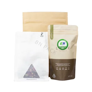
Personalized coffee packaging strengthens brand identity by making the same visual system appear at every purchase: logo placement, colors, typography, roast data, origin details, materials, and pack format. McKinsey’s 2023 survey of more than 11,500 consumers across 11 countries found that shelf life and hygiene ranked among the most important packaging concerns, while about two-thirds considered sustainable packaging at least somewhat important. In the US, 43% rated environmental impact as very or extremely important. A coffee bag therefore has to identify the roaster, separate one SKU from another, protect aroma, and present credible product information within a few seconds of shelf or online viewing.
A coffee brand can start by keeping several visual elements fixed across every bag. The logo can occupy the same upper area, the coffee name can use one type family, and origin, process, roast level, net weight, and tasting notes can follow the same reading order. Product colors may change by origin without changing the underlying layout. In 2023, one in three consumers surveyed by McKinsey had tried a new brand during the previous three months, so recognizable packaging matters when established products sit beside unfamiliar ones.
That fixed structure becomes more useful when the range grows. A roaster selling 3 blends, 8 single origins, one decaf, and 4 seasonal releases does not need 16 unrelated designs; it needs one system with controlled variation. A customer should be able to identify the producer before reading the individual coffee name, while color bands, illustrations, or label fields separate the SKUs.
A practical test is to cover the logo and place five products together. If their typography, information order, materials, and visual proportions still look related, the packaging system is doing more than displaying a brand mark.
Recognition alone is not enough because roasted coffee is a food product with physical storage requirements. Oxygen, moisture, light, temperature, and time affect aroma and flavor, so visual design has to work around suitable barrier films, seals, closures, and one-way degassing valves rather than replacing them. McKinsey’s 2023 research across 11 countries found shelf life consistently ranked above environmental concerns in packaging priorities, placing product protection ahead of decorative choices.
That relationship changes how premium positioning should be handled. A matte pouch, clean typography, accurate print registration, a stable bottom gusset, and a zipper that closes consistently can support a higher-priced specialty coffee more convincingly than decorative foil used on a weak bag. The customer handles the package repeatedly, often for 1–3 weeks, so opening, resealing, pouring, storage, and label readability become repeated encounters with the same brand.
Product information can then provide a second layer of identity. Specialty coffee can carry more useful detail than many packaged foods because buyers may want country, region, producer, farm, variety, elevation, process, roast date, tasting notes, and brewing guidance. Rather than placing every field at equal size, packaging can separate information by reading priority:
-
Front: brand, coffee name, origin, major flavor notes, net weight.
-
Secondary area: producer, region, variety, process, elevation, roast profile.
-
Back or side: sourcing notes, brew guidance, certifications, disposal instructions, QR destination.
A structure like that also reduces inconsistency when new coffees arrive every few weeks. If a 2026 harvest from Ethiopia replaces a previous lot, production staff only need to change variable fields instead of rebuilding the package. Batch-specific labels or digitally printed pouches can handle smaller runs, while the permanent brand elements remain unchanged.
Personalization also gives coffee companies room to tell customers why two similarly priced bags are different. One product may feature a washed process and citrus-forward profile, while another may use natural processing with heavier fruit notes. Showing factual distinctions is more useful than filling space with broad statements such as “crafted with passion.” Specific information gives shoppers material they can compare before buying.
“Ethiopia, Guji, 2,100 m, washed, heirloom varieties, roasted May 18” communicates far more than a generic premium claim because every line describes something that can be checked.
The same principle applies online, where packaging often appears as a small product image rather than a full-size bag. McKinsey reported in 2023 that most consumers use at least three channels during a purchase journey, while 75% want a seamless omnichannel experience and only 25% say they receive one. A coffee pack therefore needs to look related to the website, subscription box, café menu, email imagery, and marketplace listing rather than functioning as a separate design project.
| Packaging element | Brand use | Information it can carry |
|---|---|---|
| Front panel | Fast recognition | Brand, origin, coffee name |
| Color system | SKU separation | Blend, roast, region, season |
| Side/back panel | Product detail | Process, variety, brew notes |
| QR code | Extended content | Producer page, brewing guide |
| Finish/material | Physical consistency | Matte, gloss, paper-like texture |
| Variable print | Small-run personalization | Batch, date, partner, edition |
Materials deserve similar attention because environmental claims can affect how buyers judge a brand. McKinsey’s 2023 US research found 43% of consumers considered environmental impact very or extremely important when evaluating packaging, while roughly half said they would pay a premium for more sustainable options; about 50% were willing to pay 1–3% more, 25% would accept 4–7%, and about 12% would accept 7–10%.
For coffee companies considering sustainable recyclable packaging, material descriptions should stay specific. “Recyclable” should not be treated as interchangeable with “recycled,” “compostable,” or “biodegradable.” Collection systems also differ by location, so a package can state its material structure and disposal route rather than relying on broad environmental wording.
US waste data shows why precision matters. The EPA reported that containers and packaging accounted for 82.2 million tons, or 28.1% of municipal solid waste generation, in 2018. Overall packaging recycling reached 53.9%, but plastic containers and packaging were recycled at only 13.6%; more than 69% of plastic packaging in that dataset went to landfill. A coffee company using environmental language therefore benefits from checking actual material compatibility and available collection routes before printing claims.
Consumer understanding is also uneven. In McKinsey’s 2023 US study, 72% viewed compostable packaging as very or extremely sustainable and 70% said the same about plant-based formats, while 29% still rated combinations of plastic, paper, and aluminum foil highly despite multilayer structures often being harder to recycle. Clear material labeling can therefore add useful information where appearance alone may give the wrong impression.
Personalization can extend beyond retail SKUs without changing the main identity. A roaster can keep the same pouch architecture while producing editions for hotels, restaurants, office programs, subscriptions, weddings, or corporate gifts. The partner name can occupy a defined co-branding area, while the roaster’s typography, product data, and package proportions remain stable. A 500-unit hospitality run can then look related to a 20,000-unit retail line without requiring a separate visual language.
Limited releases benefit from the same restraint. A holiday illustration, anniversary date, farm photograph, or collaboration label can change, but logo position, type hierarchy, product-information order, and package construction should remain familiar. That balance lets a seasonal bag look different enough to attract repeat buyers without making the company appear to be a different roaster every quarter.
QR codes add another layer when printed space is limited. A bag can carry 6–10 essential fields while a code opens a producer profile, brewing guide, lot information, or subscription page. Product-specific destinations are more useful than sending every scan to a homepage because the customer arrives at information connected to the coffee already in hand.
The final production check should combine appearance with repeatable manufacturing. Print tolerances, zipper position, valve position, seal width, label adhesion, barcode contrast, legal text, and net-weight placement should be checked on an actual filled pouch rather than only on a digital mockup. A strong identity survives printing, filling, shipping, shelf display, opening, and repeated home use, not just presentation on a design screen.
That manufacturing discipline also controls growth. A roaster moving from 4 products to 20 can maintain the same brand system by defining fixed fields, variable fields, approved colors, minimum logo sizes, print specifications, and copy limits before adding SKUs. Instead of redesigning every launch, staff update a controlled set of information, giving retail, wholesale, subscription, and limited-release packages a consistent family appearance across 2026 and later production cycles.